How Sudha Solutions built the A+ content and PDP strategy for Ecommerce brand like Khetika – across dry fruits, stoneground batters, chutneys, and spices.
TL;DR — What This Article Covers
- The research process behind Khetika’s A+ content and PDPs; across three product categories
- How content strategy differs for dry fruits, millet batters, chutneys, and spices
- The design language and copy principles that make clean-label content convert
What good A+ content actually does for a brand in a trust-deficit category
The Brand That Bets Everything on Honesty
Khetika was built on a single uncomfortable observation: most of the food sitting in Indian kitchens, the spices, the batters, the dry fruits, had been quietly compromised. Adulteration. High-temperature processing that stripped nutrition. Preservatives added because the supply chain was too broken to work without them.
Dr. Prithwi Singh, Darshan Krishnamurthy, and Raghuveer Allada founded Khetika in 2017 not to build a food brand, but to rebuild a food system. Stone-ground spices from named farms in Rajasthan. Ragi and Jowar batters made in nano-plants and delivered within 24 hours. Makhana sourced directly from Bihar’s Mithilanchal belt.
The brand’s real product is trust. The food is just evidence of it.
That’s the context in which Sudha Solutions was brought in to work on Khetika’s A+ content and Product Detail Pages (PDPs); across three distinct product categories: Dry Fruits & Nuts, Stoneground Batters & Chutneys, and Powdered Spices.
This is a detailed account of how we approached that work. The research. The thinking. The design decisions. And the content principles that guided everything we built.
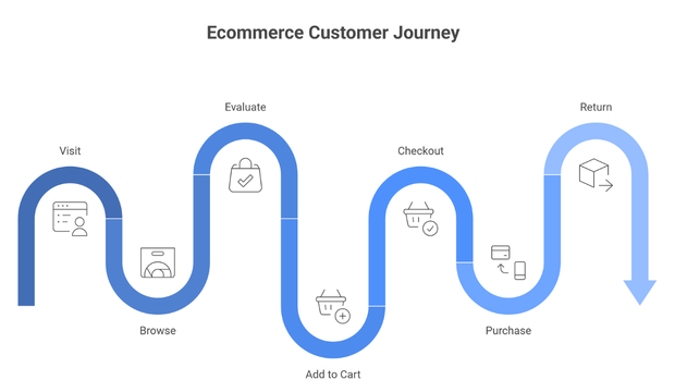
What Is A+ Content – and Why Does It Matter for Food Brands?
A+ content refers to enhanced product page modules available to brands on e-commerce platforms. Beyond a standard product description, A+ content lets brands use rich imagery, comparison charts, feature callouts, and storytelling modules to communicate their product’s value.
For most product categories, A+ content is a conversion tool. For clean-label food brands, it is something more: it is a credibility tool. In a category where ‘natural’, ‘pure’, and ‘preservative-free’ have been co-opted by brands that don’t fully mean them, A+ content is the space where a brand like Khetika can slow the buyer down and show them why this product is actually different.
Research consistently shows A+ content improves conversion rates for food products when it answers the specific questions buyers arrive with; not just describes what’s in the packet.
For Khetika, buyers across all three categories came with questions that standard product descriptions almost never answered:
- Is this actually stone-ground or is that just branding?
- What does a 10-day shelf life mean for a batter; does it ferment on its own?
- Where exactly does this turmeric come from and how is it processed?
- Why is this makhana priced the way it is; what am I actually paying for?
A+ content, built right, answers these before the buyer has to ask them.
The Research That Came Before a Single Design
Sudha Solutions does not begin content work without a research phase. For Khetika, this meant running four parallel streams of discovery before a brief was written or a wireframe was touched.
Understanding the Brand From the Inside Out
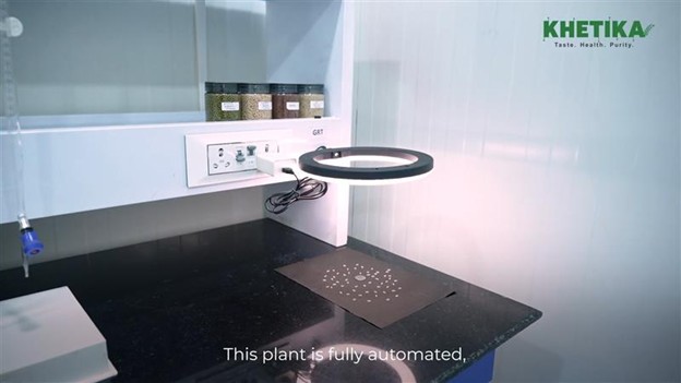
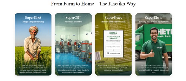
We spent significant time studying Khetika’s operations – not just the brand story, but the functional reality behind it. Their SuperZop platform connecting farmers across 14 Indian states. The nano-plant model: smaller urban facilities that manufacture batters and chutneys within proximity of the customer, enabling a 24-hour production-to-delivery window. The stone-grinding method using authentic red stone sourced from Karoli, Rajasthan; where the stone’s mineral composition, not just its hardness, affects how spices are ground.
We studied their SuperGRT™ AI quality control system, their QR-code traceability (every product links back to harvest date and farm origin), and their decision to operate with IoT-enabled monitoring at manufacturing facilities. These are not brand story embellishments. They are operational facts; and they became the evidentiary backbone of every content module we built.
This is where professional UI UX design and mobile-first UX strategy directly impact ecommerce conversions.
Category Analysis – How Competitors Were Positioning
We audited product pages across all three categories on the primary platforms Khetika sells through. Patterns emerged quickly:
- Dry Fruits & Nuts: Most brands led with quantity and price per gram. Very few communicated sourcing origin or processing method. The clean-label angle was almost entirely absent.
- Batters & Chutneys: The benchmark was market leaders in the batter category. Their content focuses on convenience and recognisability. Process storytelling is thin. The nutritional case for millet-based batters (versus plain rice batter) was left entirely to the buyer to research.
- Spices: Post the 2024 MDH and Everest international ban controversy, where both brands faced regulatory action for detected pesticide residues, buyers in this category had become measurably more label conscious. Yet most spice pages still relied on vague purity language (‘100% natural’, ‘no added colour’) with zero process or origin specificity.
The gap Khetika could own was clear: specificity, provenance, and process. These were under-represented across every category; and they were Khetika’s actual strengths.
Consumer Intent Research – What Buyers Were Actually Searching For
We mapped real buyer questions across each category using search intent analysis and review pattern study. This shaped the structure of every PDP and the priority of every A+ module.
The highest-frequency unresolved questions, by category:
- Makhana: Origin (Mithilanchal sourcing), roasting method, how to tell quality makhana from low-grade, and whether flavoured variants use real ingredients or coating agents.
- Batters: Whether the batter arrives fermented or raw, how long it takes to ferment at home, what makes ragi batter different from standard batter, and shelf life guidance.
- Chutneys: Preservative questions, storage post-opening, whether the taste profile is restaurant-style or home-style, and how to pair with specific foods.
- Spices: Origin specificity, grinding temperature (and why it matters for nutrition and flavour), pesticide testing and certification, and ASTA colour value for red chilli.
Platform & Format Research
We reviewed A+ content performance benchmarks specific to the food and FMCG category on Indian e-commerce and quick-commerce platforms. Key findings: comparison module layouts outperform simple feature grids for considered purchases; lifestyle imagery showing the product in actual use (batter being poured, chutney being served, spices being measured into a dish) significantly reduces return rates; and mobile-first UI/UX design, where the first two modules must do the heavy lifting, is non-negotiable given that quick commerce, Khetika’s fastest-growing channel, is almost entirely a mobile buying experience.
The Content Strategy: Four Principles That Ran Across Every Category
The research gave us the inputs. Strategy gave us the filter. We built the content framework for Khetika around four principles that ran consistently across all three product categories, while allowing for distinct storytelling in each.
Process Is the Product
For most food brands, the product is what’s in the packet. For Khetika, the product is also how it got into the packet. Direct procurement from named farms. No fermentation shortcuts in batters. No colourants in spices. No coating agents on makhana.
We built every A+ content module with the process visible; not buried in fine print, but front and centre. For the spice range, this meant a dedicated module that walked the buyer through the journey from single-origin farm to stone-ground finish, with a visual comparison of conventional industrial grinding versus Khetika’s method. For the batter range, it meant explaining the nano-plant model: why making batter 24 hours away from delivery, rather than in a centralised facility days in advance, produces a product that behaves like homemade.
Category-Specific Emotional Register
Each of Khetika’s three categories speaks to a different moment in the consumer’s life – and a different emotional register.
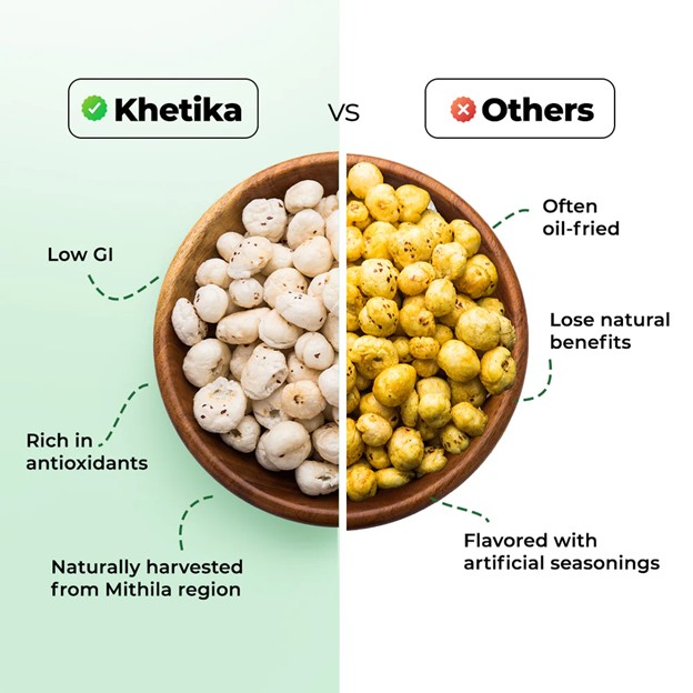
Dry Fruits & Nuts – The buyer here is often health-motivated or gift-motivated. They’re already willing to pay a premium; what they need is confidence that the premium is justified. Content for this category led with provenance, purity, and the story of why Khetika’s makhana from Mithilanchal is categorically different from commoditised alternatives.
Stoneground Batters & Chutneys – This category carries the strongest emotional resonance of the three. Every South Indian household has a grandmother who made batter from scratch. Every family has a memory of coconut chutney made fresh. Our content leaned into this – not nostalgically, but functionally. We built content that explained how Khetika’s stone-ground process actually preserves the texture and fermentation behaviour of a homemade batter, and how their preservative-free chutneys replicate what fresh looks like at scale.
Powdered Spices – Post-2024, the spice category had a trust problem that was industry-wide. Khetika’s content didn’t dance around it. We positioned the spice range as the answer to a real and documented concern: single-origin sourcing, named farms, cold-stone grinding, and transparent quality testing. The emotional register here was not warmth; it was credibility.
Proof-First Copy – Every Claim Earns Its Place
The clean-label food category has been polluted by marketing language that sounds meaningful and means very little. ‘Pure’, ‘natural’, ‘chemical-free’, ‘premium’ – these phrases have been used so often that buyers have learned to look past them.
We applied a strict discipline across all Khetika copy: every claim required a specific, verifiable fact within the same sentence or module. No assertion without evidence.
- Not ‘pure spices’ – ‘stone-ground’ using red stone from Karoli, Rajasthan, to preserve the spice’s natural essential oils’
- Not ‘fresh batter’ – ‘prepared in our Mumbai nano-plant and delivered to your door within 24 hours of manufacture’
- Not ‘premium makhana’ – ‘single-origin from Bihar’s Mithilanchal belt, the largest makhana-producing region in the world, dry-roasted without oil or coating agents’
- Not ‘preservative-free chutney’ – ‘India’s first clean-label stone-ground chutney at scale, with a long shelf life maintained through refrigerated logistics, not additives’
This is not copywriting as word-choice exercise. It is copywriting as trust architecture.
Mobile-First Design Hierarchy
The majority of Khetika’s quick-commerce buyers make purchase decisions on a phone, scrolling fast. This made mobile-first design hierarchy non-negotiable; not a version of the desktop design, but the primary frame of reference for every module.
In practice, this meant: headlines and sub-headlines that communicate value independently of the body copy (because most buyers won’t read the body on first pass); feature callout icons that work at small scale without losing legibility; lifestyle imagery that reads even as a thumbnail; and benefit language that delivers its most important word in the first three words of the sentence.
How the Content Was Built – Category by Category
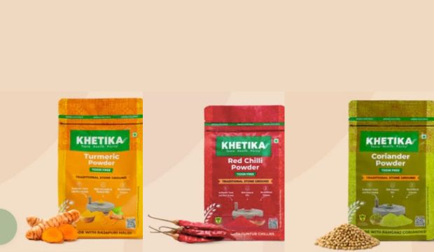
Dry Fruits & Nuts: Makhana and Pistachios
Khetika’s dry fruit range included Naturale Makhana and Premium Roasted Salted Pistachios – two products with premium positioning in a category where most buyers are used to buying from loose bins or unbranded retail packs.
Khetika Naturale Makhana
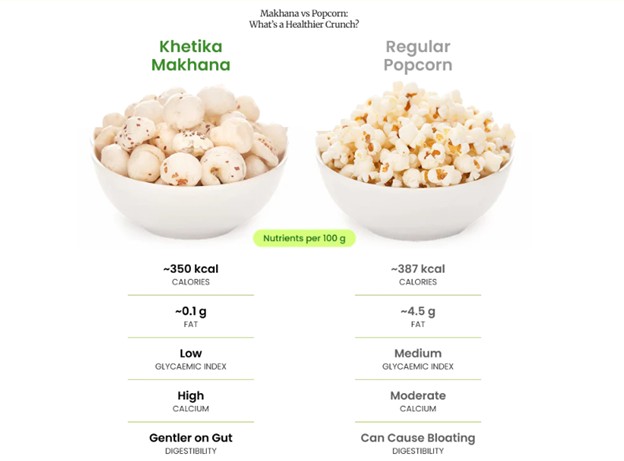
Makhana has had a well-documented moment in India’s health food market. Demand for this fox nut, traditionally consumed as a fasting food and now embraced as a high-protein, low-calorie snack, has grown sharply. But the market has also grown noisy. Multiple brands entered quickly, and many sell undifferentiated product with only branding as the lever.
The PDP and A+ modules for Khetika’s Makhana were anchored in three proof points: single-origin sourcing from Mithilanchal (named, specific, checkable), the absence of oil and coating agents in the roasting process, and the nutrient case – makhana’s protein and calcium profile compared to conventional snack alternatives. The design used deep cream and earth tones to reinforce the natural credential, with a sourcing story module that placed the product geographically and culturally, not just nutritionally.
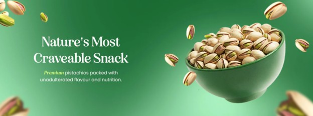
Khetika Premium Roasted Salted Pistachios
The pistachio PDP content led with the roasting process (dry-roasted, no oil, no flavour enhancers), origin transparency, and snacking occasion positioning. The design language shifted slightly warmer and richer than the makhana range; reflecting the product’s nature as an indulgent-but-responsible snack. The A+ modules included a ‘what makes premium different’ comparison layout and a suggested pairing / occasions section designed to drive repeat purchase frequency.
Stoneground Batters & Chutneys – The Category That Carries the Most Weight
This is the category where Khetika holds its most differentiated position; and where the content challenge was most complex. The full range Sudha Solutions worked across:
- Ragi Idli Dosa Batter
- Jowar Idli Dosa Batter
- Fresh Idli Dosa Batter
- Chilla Batter
- Coconut Chutney
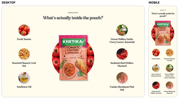
- Tomato Chutney
- Peanut Chutney
The structural challenge: each of these products belongs to a category with deep household familiarity. Every buyer already has a mental reference for what good batter or chutney looks like, tastes like, and behaves like – because they’ve eaten versions of it their whole lives. That familiarity is an asset and a constraint. Content has to meet the buyer’s prior experience and then move them beyond it.
Ragi and Jowar Batters – Selling the Millet Advantage
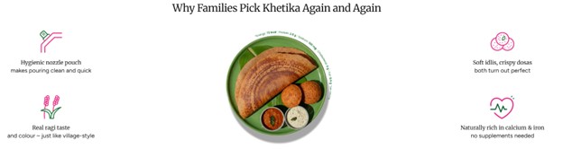
The millet batter range required a content layer that most food brands skip: category education. Many buyers interested in Ragi or Jowar batter are making a conscious nutritional shift; moving away from plain rice batter toward options that carry higher fibre, calcium (in the case of ragi), and lower glycaemic load. But they often don’t know how that shift manifests in practice: does ragi batter ferment differently? Does it behave the same on a tawa? Does it taste distinctly different to a child who won’t eat ‘health food’?
The A+ content built for these SKUs included a dedicated module addressing each of these questions without it feeling like a FAQ dump. We wove the answers into the product narrative; explaining the stone-grinding method’s role in preserving ragi’s bran layer (the part most industrial milling strips away), and how Khetika’s batter arrives unfermented because it’s made in a nano-plant close to the customer, not pre-fermented in a central facility days ahead.
Fresh Idli Dosa Batter – Making the Familiar Exceptional
The Fresh Batter PDP had a different challenge: in a market where the buyer has the most options and the lowest default switching cost (they can always make it at home), the content had to make a case for convenience without sacrificing the quality story. The copy anchored on the nano-plant proximity model, batter made near you, not in a factory three states away, and the stone-grinding difference, which gives the batter a texture and fermentation behaviour closer to home-ground than blade-milled alternatives.
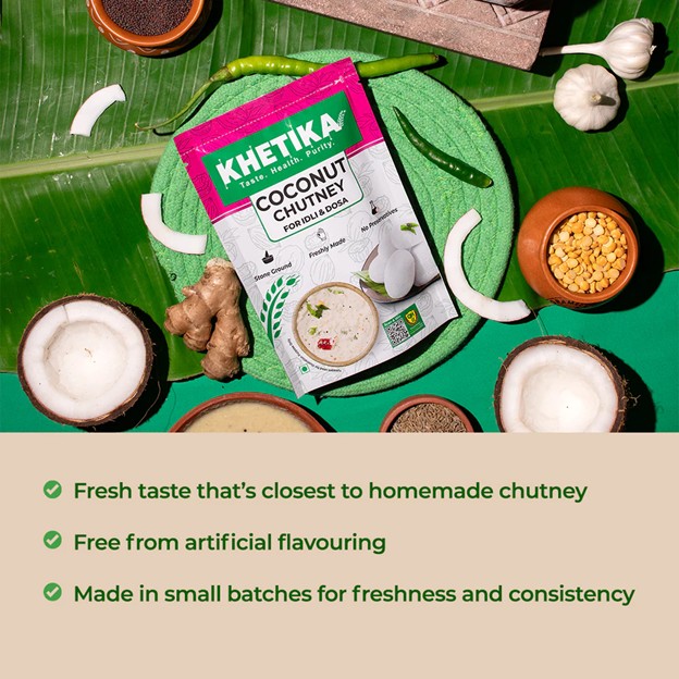
Coconut, Tomato & Peanut Chutneys – A Category That Barely Existed
Khetika’s chutney range is, by their own account, India’s first clean-label stone-ground chutney at commercial scale. There is no real category precedent. Most chutneys available in packaged form either rely on preservatives or taste noticeably different from fresh.
This created both a content opportunity and a content risk: buyers had no existing mental model to map the product to. The A+ content strategy here was to link the product to the memory of fresh, taste notes, texture descriptors, serving suggestions that placed the chutney beside a hot dosa or idli in the reader’s imagination, while making the clean-label proof tangible: A better shelf life maintained through cold supply chain, stone-ground to preserve flavour profile, no vinegar or artificial acid for preservation.
Powdered Spices: Content in a Trust-Deficit Category
The spice category is the most scrutinised food segment in India following the 2024 international bans on two major Indian spice brands over detected pesticide residues. Consumer trust in spice labelling hit a measurable low. Into this environment, Khetika’s spice range, with its single-origin sourcing, named farms, and cold-stone grinding, was a genuine differentiator. The content had to make that difference impossible to miss.
Turmeric – From Sangli, Ground Cold
The Turmeric PDP and A+ content was built around a specific and verifiable claim: Rajapuri Haldi from Sangli, a region known for its naturally elevated curcumin concentration. The grinding temperature ( which preserves curcumin and essential oils that high-temperature industrial grinding degrades) was explained in plain terms, not jargon. A comparison module placed Khetika’s method against conventional processing; making the nutritional and flavour case without requiring the buyer to already understand food science.
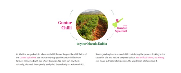
Red Chilli – Colour, Heat, and Traceability
For Red Chilli, the content led with ASTA colour value, a measurable industry standard for chilli colour intensity, and positioned Khetika’s sourcing and grinding process as the reason for a higher, more consistent value than commodity alternatives. The origin story (named farm clusters, single-variety sourcing) was the trust anchor. The design used bold, appetite-forward visuals that communicated the product’s quality through colour richness and texture.
The Design Language – What Khetika’s Content Looks Like
Content strategy without design direction is half a job. The visual language of A+ content and PDPs is not decoration; it directly affects whether a buyer pauses or scrolls past, whether they trust the claim being made, and whether the premium positioning feels earned.
Sudha Solutions’ design approach for Khetika’s content was built around four decisions:
Colour: Grounded, Not Clinical
Khetika’s visual palette draws from its ingredients. Turmeric yellows. Ragi and earth browns. Pistachio greens. Chilli reds. Coconut cream. These are not arbitrary colour choices – they are the palette of real, unprocessed food. We used this as the chromatic anchor for every module, avoiding the clinical whites and flat gradients common in health-positioned food brands that look like supplements rather than staples.
Photography Direction: Texture Over Perfection
Studio-perfect product photography achieved with AI, where every grain is equidistant and the surface is artificially even, works against the clean-label positioning. We directed image selection and production guidance toward photography that shows texture, irregularity, and the evidence of minimal processing: the coarse grind of a spice, the visible grain of a batter, and the rustic spread of a chutney. These visual details are proof.
Typography Hierarchy: Built for Skim and Read
Given the mobile-first buying context, we designed typographic hierarchy for two types of readers: the skimmer (who reads only headlines and callouts) and the reader (who reads everything). Headlines had to deliver complete value independently. Body copy had to reward attention with depth. No module was designed where the value only emerged after reading three lines.
Module Structure: Earned Complexity
A+ content can become visual noise when too many module types are stacked without purpose. We applied a ‘minimum sufficient complexity’ principle: every module had to earn its place by answering a specific buyer question or building a specific dimension of trust. Comparison tables appeared only where a genuine comparison was useful. Feature icon grids were used only where individual features warranted independent emphasis. Lifestyle imagery was placed at moments in the scroll where the buyer needed an emotional anchor, not more information.
How Sudha Solutions Ran the Project
A+ content and PDP work across 15+ SKUs in three product categories requires a structure that prevents both bottlenecks and scope drift. Here is how the engagement was run.
Discovery and Brand Brief
The project opened with a structured brand discovery session. Brand voice, buyer personas, existing content pain points, platform specifications, and priority SKU sequencing. The output was a working content brief that both teams could refer to throughout; reducing revision cycles and ensuring alignment before work began.
Research and Strategy Sign-off
Before a single design was created, we presented the category research and content framework to the Khetika team. Alignment at the strategy stage prevents expensive rewrites at the execution stage. This is a step many agencies skip; it is one we consider non-negotiable.
Parallel Content and Design
Sudha Solutions works with content and design in parallel, not in sequence. Copy drafts and design wireframes are developed together, so the module layout flexes around the message rather than the message being retrofitted into a pre-set visual template. This is especially important for A+ content, where the structure of the module should be driven by what needs to be communicated, not by default template selection.
Structured Review Cycles
Two rounds of structured review per category. Feedback captured in annotated design files, not open-ended email threads. Each comment linked to a specific visual element or copy block, with a clear action attached. This approach cut revision time significantly and eliminated the ambiguity that typically inflates timelines on content projects.
Delivery and Handoff
Final assets were delivered in platform-ready formats with clear naming conventions and a per-SKU delivery checklist. A brief content guide was included so Khetika’s team could apply the same framework consistently when adding future SKUs.
What Does Good A+ Content Actually Do for a Clean-Label Brand?
The question worth answering directly: beyond looking better than a generic product page, what does this content work actually achieve?
It converts the undecided buyer without pressure
The buyer who has landed on a Khetika product page already has some awareness – they came from search or quick-commerce browse. What they don’t yet have is confidence. Good A+ content closes that gap with specificity: a named origin, a visible process, a real reason behind the price point. This kind of content converts by informing, not by promoting.
It builds brand memory at the first transaction
The first purchase is not just a transaction – it is a brand experience. A buyer who comes away from a Khetika product page knowing where their turmeric was grown and how it was ground is a different kind of customer than one who simply bought the cheapest option. That knowledge creates the conditions for loyalty.
It sets accurate expectations, which reduces returns
Fresh products with short shelf lives, Khetika’s batters and chutneys especially, carry a higher post-purchase risk if expectations are misaligned. Clear, honest content about shelf life, storage requirements, and product behaviour (batter that ferments in the customer’s kitchen rather than arriving pre-fermented) reduces disappointment and the dissatisfied reviews that follow.
It supports premium pricing with evidence, not assertion
Premium pricing in food is justified by two things: demonstrable quality and trust. Both of these are content problems as much as product problems. When a buyer can see exactly why Khetika’s makhana costs more than the local store alternative, named origin, no coating agents, dry-roasted without oil, the price becomes a feature, not a friction point.
Content That Takes the Brand as Seriously as the Product
There is a version of this project that could have been executed as a production task. Take the product specs. Write clean bullets. Design a respectable-looking layout. Deliver on time.
That version would have been fine. But it would not have served a brand like Khetika.
Khetika has spent years building a supply chain that most brands would consider irrational. Buying authentic stones from Karoli. Teaching farmers IPM practices. Building nano-plants in Mumbai and Delhi so batters don’t spend three days in transit before reaching a kitchen. These decisions are not just operational – they are expressions of what the brand believes.
Content that doesn’t reflect that depth does the brand a disservice. It reduces a thought-through, infrastructure-backed product story to a product description.
That is the standard we hold ourselves to for every brand we work with.
Working With Sudha Solutions
If you’re looking to improve your product page performance, working with experienced content marketing experts and a professional UI UX design team can significantly increase your conversions.
At Sudha Solutions, we provide UI UX design services and content marketing services tailored for ecommerce and FMCG brands — from A+ content design to complete product detail page optimization.
Sudha Solutions partners with food, wellness, and FMCG brands to build content that earns trust at the point of purchase. If your product has a real story behind it and your content isn’t telling it yet; that’s the problem we exist to solve.
Get in touch: [email protected] | https://www.sudhasolutions.com/ | Linkedin.com/Sudhasolutions
Frequently Asked Questions
What is A+ content for food brands on e-commerce platforms?
A+ content is an enhanced product page format available to brands on e-commerce platforms like Amazon and quick-commerce apps. For food brands, it allows the use of rich imagery, comparison modules, process storytelling, and benefit callouts beyond a standard product description. For clean-label food brands in particular, A+ content is a credibility tool; it answers the specific questions health-conscious buyers arrive with before they can voice them.
What does A+ content actually cost a brand, and is it worth the investment?
A+ content for food brands is a conversion investment. Brands that invest in research-backed, category-specific A+ modules consistently see better add-to-cart rates and lower return rates than those running generic product descriptions. At Sudha Solutions, we build A+ content that pays for itself by making your product’s real story visible at the exact moment a buyer is deciding. If you’re unsure whether your current pages are doing that job, we’re happy to take a look.
How long does it take to build A+ content and PDPs for a product range?
For a range of 5-15 SKUs across one or two product categories, a well-run A+ content and PDP project typically takes 4–6 weeks from discovery to final delivery – covering research, content strategy, copy, design, and review cycles. Rushing this process is where most brands lose value. At Sudha Solutions, our parallel content-and-design process keeps timelines tight without cutting corners on the research that makes the content work.
Can a content agency really understand a niche food category well enough to write about it accurately?
Only if they do the work before they write. Generic content agencies write from templates. We research the supply chain, study the buyer’s real questions, audit how competitors are positioning, and map the specific claims that your product can actually support. Our work with Khetika, across stone-ground spices, millet batters, chutneys, and dry fruits, is an example of what category depth looks like in practice. If your brand is in a specialised food or FMCG category, that depth is exactly what we bring.
How do I know if my existing product pages need to be rebuilt or just refreshed?
A few signals that your pages need more than a refresh: buyers are landing but not converting, you’re getting post-purchase complaints that suggest misaligned expectations, your pages rely heavily on generic claims like ‘natural’ or ‘premium’ without proof, or your A+ modules were built from a template rather than from a buyer and brand brief. If any of these sound familiar, Sudha Solutions offers a content audit as a starting point; so you know exactly where the gaps are before any work begins.
What is the difference between A+ content and a standard product description?
A standard product description is text and a few images. A+ content allows brands to build structured visual modules, comparison charts, feature icon grids, sourcing maps, lifestyle imagery, process diagrams, that tell a product story at depth. For food brands, this additional space is the difference between a buyer who adds to cart and a buyer who bounces to a cheaper alternative.