


If you have ever spent weeks perfecting the copy on a client’s website, only to watch analytics show that users spend an average of 54 seconds on the page before leaving, you already know the problem. The content was good. The writing was clear. But without professional UI/UX design, SEO-friendly website design, and scanner-first structure, even great content often fails to hold user attention. But it was built for someone who reads. And most of your users do not read. They scan.
This is not a criticism of your audience. It is simply how the human brain processes information-dense digital environments in 2026. Understanding this shift is at the core of how we approach every website project at our agency. This guide walks through the full picture: why scanning has become the default behaviour, what most websites get wrong, and exactly how to design and build for the way users actually consume content today.
The Attention Economy Has Changed Web Behaviour Forever
Let us start with a number that should change how every client thinks about their website: Users read, on average, only 20 to 28% of the words on a webpage. This figure comes from decades of research by the Nielsen Norman Group, and it has held consistent across device types and industries. This shift has made mobile-first website design and website usability optimization critical business priorities.
The common response to this is to blame short attention spans. But that is not quite right. Users are not leaving because they lack patience. They are scanning first to decide whether the page deserves their attention at all. Think of it as a triage process. The scan comes before the read, and for most pages, the scan is all they ever do.
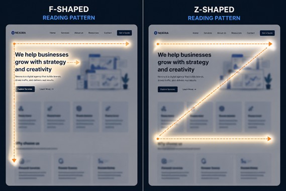
Eye-tracking research reveals two dominant visual patterns:
- The F-pattern: Users read across the top, then scan down the left edge in shorter and shorter horizontal passes, creating an F-shaped trail.
- The Z-pattern: Common on simpler pages, the eye moves across the top, diagonally down to the left, then across again toward the bottom right, typically toward a CTA.
Neither pattern involves reading every word. Both patterns reward pages where the most important content lands in those high-attention zones.
Mobile has amplified all of this. The primary browsing context for most users is now a phone, held in one hand, often while doing something else. Scroll behaviour on mobile is fast, thumb-driven, and frequently interrupted.
For businesses, the consequences are real.
- Every piece of content your client has invested in goes unread.
- Leads that could have converted scan a value proposition they cannot find quickly and leave.
- SEO rankings suffer because dwell time and engagement signals are poor.
- The website looks fine in design reviews but consistently underperforms in the real world.
This is also why answer-led content and scanner-first layouts are becoming essential for both user retention and AI visibility.
Why Most Websites Are Still Built for Readers
Many outdated websites fail not because of poor messaging, but because they lack conversion-focused web design. If scanning is so common, why do most websites still feel like brochures?
The answer lies in how websites are created.
How Content Usually gets Written
Most clients write their own website copy. And naturally, they write it like a business document:
- Structured arguments
- Complete sentences
- Context before conclusion
This leads to what we call a “content dump”:
- Everything important is added to the page
- Information is stacked paragraph by paragraph
- Every point gets equal visual weight
How Design Adapts
Once the content is ready, the design is built around it:
- Long text-heavy sections
- Wide content blocks
- Minimal visual breaks
On the surface, it looks polished. It even reads well when someone takes the time to go through it slowly.
The Real Problem
The people reviewing the website are not the real users.
Stakeholders:
- Read every word carefully
- Care about accuracy and completeness
- Evaluate content deeply
But actual users:
- Scan quickly
- Look for specific answers
- Leave if they do not find value immediately
So, the website passes internal review and fails in the real world.
The Cost of this Mismatch
The impact shows up clearly in performance metrics:
- High bounce rates
- Low scroll depth
- Poor conversion rates
- Content that delivers little ROI
This gap between stakeholder expectations and real user behaviour is one of the most common issues businesses faces.
The Scanner-First Design Framework
At Sudha Solutions, our UI UX design services combine scan-readiness with SEO and AEO frameworks to improve both engagement and discoverability.
Designing for scanners does not mean dumbing down content. It means restructuring how that content is presented so that a user moving quickly can still extract the most important information, and so that the decision to slow down and read more feels natural and rewarded.
Here is how we approach it.
Visual Hierarchy as Information Architecture
The most important principle in scanner-first design is that your visual hierarchy should do the storytelling. A strong SEO-friendly website structure ensures users and search engines can both understand page importance instantly. If a user reads only the headlines and subheadings on a page, they should come away with the core message intact.
This means:
- Headlines that communicate a complete idea, not just a label
- A typographic scale where H1, H2, H3, and body text are clearly distinct in weight and size
- One dominant call to action per viewport section, not three competing links
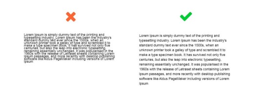
Chunking Content for Scannable Consumption
Dense paragraphs are the enemy of the scanner. The research is consistent: users skip large blocks of text almost entirely. Breaking content into smaller, purposeful pieces removes that friction.
In practice, this looks like:
- Paragraphs of three to five lines maximum
- Meaningful subheadings roughly every 150 to 200 words
- Progressive disclosure, where the headline gives the summary and the paragraph provides depth for users who want it
Example: Consider a law firm’s “Why Choose Us” section.
A reader-first version might be three paragraphs about the firm’s history and values.
A scanner-first version leads with four bold benefit statements (“Fixed-fee pricing”, “Response within 24 hours”, “30+ years of commercial law experience”, “Dedicated client portal”) and uses a short paragraph beneath each one for anyone who wants more detail. The scan tells the whole story. The read adds confidence.
Whitespace as a Design Decision
One of the most consistent pushbacks we get from clients is that whitespace feels like “empty space.” It is not. Whitespace is the visual rest that allows the eye to move from one chunk of information to the next without cognitive overload.
Generous spacing between sections, comfortable line height, and padding around calls to action all contribute to a layout that guides the scanner naturally down the page. It also signals quality. Premium brands across every industry use whitespace deliberately. Crowded pages feel cheap and hard to trust.
Using Contrast, Colour, and Motion to Direct Attention
Not all content deserves equal visual weight. Scanner-first design uses contrast and colour intentionally to signal hierarchy: the most important element on any given section should be the most visually distinct. Subtle animations, icon accents, and typographic emphasis can draw the eye to the key message before a user has consciously decided to engage.
Copywriting and Content Structure for Scan-First UX
Effective AI-friendly website structure now requires content that is readable by humans and extractable by search engines.
Design can only do so much. The underlying content structure has to work for scanners too. This is where our agency works closely with clients during the content phase of a project, often before a single wireframe is drawn.
Lead With the Conclusion
Traditional writing builds to a point. Scan-first writing opens with it. The inverted pyramid, borrowed from journalism, puts the most important information first and supports it below. On a homepage, this means your hero section should complete the sentence “We help [who] achieve [what]” before asking users to scroll at all.
The Headline-Only Test
One of the most useful exercises we run with clients is the headline-only test. We extract every H2 and H3 from a page draft and read them in sequence, ignoring all body copy. If that list of headings does not tell a coherent, compelling story on its own, the page needs restructuring before it goes to design.
Writing Bullets That Actually Work
Bullet points are frequently misused. They become bullets simply because someone wanted to break up a paragraph, not because the content is genuinely list-like. Good bullets for scan-first UX follow a few rules:
- Lead with the benefit, not the feature
- Use parallel grammatical structure across the list
- Keep each point to six to ten words where possible
- Never use more than five or six bullets in a single list
Using Bold Text Strategically
Bolding is a scanning aid, but only when used sparingly. The goal is to highlight the one idea per paragraph that a scanner should take away. When everything is bold, nothing is. We advise clients to treat bold text like a highlighter: it marks the essential, not the interesting.
Page-Type Playbook: Applying Scanner-First Design
The principles above apply across every page type, but each has its own specific considerations. Here is how we apply the scanner-first framework across the most common pages in a client project.
Homepage
The homepage has one job in the first five seconds: tell the user exactly what the business does and who it does it for. Every element above the fold should contribute to that goal.
We use a simple internal test called the five-second test: show the homepage to someone unfamiliar with the brand for five seconds, then ask them what the company does. If they cannot answer clearly, the hero needs work.
Service and Product Pages
These pages are where conversions happen, so scanner-first design is especially high stakes here. Great UI/UX must also support content that converts, ensuring scanners can move from awareness to action quickly. Each service should have its own benefit-led headline, and objections should be visible in subheadings rather than buried in paragraphs. A user scanning a service page is asking “does this solve my problem, can I trust them, and what does it cost?” Those three questions should be answerable from the headings alone.
About and Team Pages
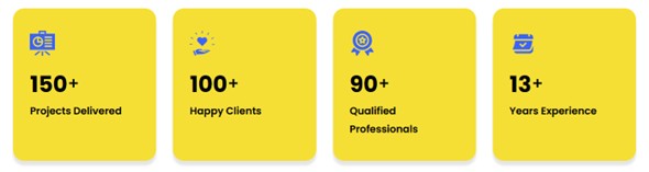
Credibility signals (years of experience, client numbers, certifications, recognisable client logos) should appear early on About pages, not at the bottom after a narrative history. Scanners will not reach the end of the story before making a trust judgement. Lead with proof, support with story.
Blog and Insight Articles
Long-form content benefits enormously from scan-friendly structure. We recommend:
- A TL;DR summary or key takeaways box at the top
- Anchor navigation for articles over 1,000 words
- Pull quotes that work as standalone scan anchors
- Section headers that summarise, not just label
Contact and Landing Pages
These pages should have a single focal point. Every competing link, navigation element, or secondary CTA is a leak in the conversion path. Scanner-first landing pages strip everything back to the one action the user should take and make that action as visually prominent and frictionless as possible.
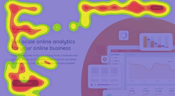
Tools, Testing, and Measuring Scan-Readiness
Heatmaps, dwell time, and engagement data also directly influence technical SEO optimization and user behaviour SEO.
Building for scanners is not a one-time design decision. It needs to be validated and refined with real user data. These are the tools and methods we use throughout and after a project.
The Blur Test: Take a screenshot of any page and reduce the opacity to around 10 to 15%. Can you still identify the most important element on the page? Is there a clear visual hierarchy? If everything blurs into an even grey, the hierarchy is not strong enough.
Heatmapping Tools: Post-launch, tools like Hotjar and Microsoft Clarity show real scroll and click behaviour. They reveal whether users are scanning in the patterns you designed for, where they drop off, and which elements are attracting attention unexpectedly. We include a heatmapping review in our post-launch process for most client projects.
Five-Second Usability Testing: Before launch, show a page to five to ten people who are unfamiliar with the brand for exactly five seconds, then ask what they remember and what the company does. This is one of the most reliable low-cost tests available for measuring scan-readiness.
According to usability research, five-second tests consistently reveal clarity issues that both designers and clients have become blind to after weeks of working on a project.
A/B Testing Layout Approaches: Where traffic volumes allow, we will test headline-driven layouts against narrative-driven ones. The results are almost always in favour of scan-first structure for conversion-focused pages, though editorial and thought leadership content sometimes benefits from a warmer, more narrative approach.
What This Means for Your Next Website Project
Websites designed for scanning, clarity, and structured authority are also better positioned for long-term AI visibility.
If your current website was built more than two or three years ago, there is a very high chance it was designed primarily for readers. That is not a failing of the agency that built it. It reflects how the industry has evolved.
Scanner-first design has become central practice only as mobile usage, content volume, and user behaviour data have matured enough to make the case undeniably.
Here is what we think every client brief should now answer before a project begins:
- Who is the primary audience, and what device are they most likely using?
- What is the one thing a user should understand within five seconds of landing on each key page?
- What is the single most important action on each page, and is everything else subordinate to it?
- Does the current content pass the headline-only test?
These questions shape everything from information architecture to copywriting to visual design. They are the lens through which we evaluate every decision in a project.
If you are not sure how your current site measures up, we offer a complimentary scan-readiness audit for businesses considering a redesign. We will review your key pages against the framework above and give you a clear, honest picture of where the gaps are and what addressing them could mean for your results.
Your users are scanning, search engines are evaluating engagement, and AI systems are extracting structure. Sudha Solutions combines professional UI/UX design, SEO expert services, and AEO services to build websites that improve visibility, usability, and conversions simultaneously.
If your website is built like a document, you are losing attention and conversions. At Sudha Solutions, we design websites that align with modern user behaviour, structured for clarity, speed, and impact. From layout to content flow, everything is built to guide the eye and drive action. Let us help you create a website your audience actually engages with. Contact us TODAY!
Frequently Asked Questions
What is scan-first UX design?
Scan-first UX design focuses on structuring content and layout so users can quickly find key information without reading everything in detail.
Why do users scan websites instead of reading?
Users scan due to information overload, limited time, and the need to quickly determine if a page is relevant before investing attention.
How does scan-friendly design improve conversion rates?
It highlights key messages, CTAs, and value propositions clearly, helping users take action faster without confusion or friction.
What are the best tools to analyse user scanning behaviour?
Popular tools include heatmaps like Hotjar, Microsoft Clarity, and eye-tracking studies that reveal how users interact with page elements.
How does mobile usage impact scanning behaviour?
Mobile users scroll faster, skim more aggressively, and rely heavily on visual hierarchy due to smaller screens and multitasking behaviour.