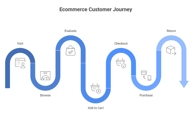
94% of people visiting your website judge it based on its design; therefore, it is crucial for a brand to nail their UI UX design. Multiple studies also show its influence in increasing conversions as it builds trust by simplifying buyer’s journey from landing to purchase.
However, most brands, especially startup focus more on pretty visuals and fancy features that are barely used. Even the best SEO services cannot compensate for a website that confuses users or creates friction. Traffic without clarity rarely converts. These do more bad than good for your business.
In this blog, we will talk about 6 common mistakes we see brands make all the time that ‘kills conversions. We will explain the psychology behind why these mistakes and what can brand change to make their website customer magnet.
Here are the top 6 Common Mistakes Done by the Brands:
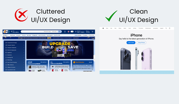
Information Overload That Obscures the Core Message
Here’s what information overload can cause:
- Information overload increases cognitive strain
When users are exposed to too much information too early, it creates confusion and anxiety rather than clarity. Instead of helping users decide, it slows them down and increases the likelihood of abandonment.
- Pages often try to explain everything at once
Design critiques frequently highlight interfaces where features, differentiators, edge cases, FAQs, and supporting content all compete for attention, leaving users unsure where to focus.
- The problem isn’t the quality of information
In most cases, the content itself is useful. The issue lies in poor prioritisation and timing, not in what is being said. Brands investing in content marketing services and structured blog writing services must ensure that valuable information is prioritised correctly; otherwise, even strong content fails to drive action.
- Conversion-focused UX prioritises restraint
High-performing experiences guide users toward one primary action, reinforce it with clear reasoning, and defer secondary details until users signal intent to explore further.
What works instead:
We prioritise clarity over completeness.
Clear visual hierarchy ensures users immediately see the primary value proposition and next action, rather than competing messages.
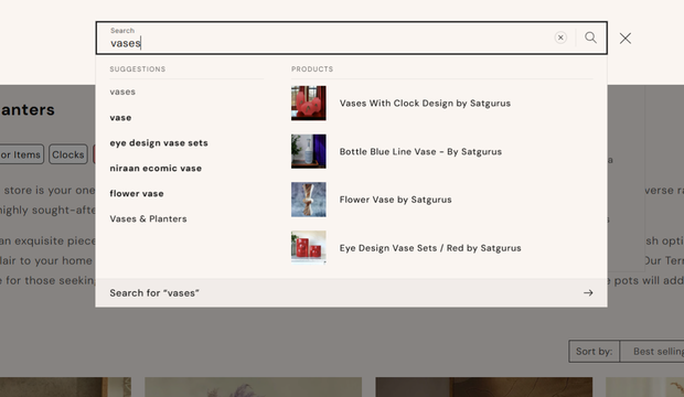
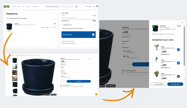
Progressive disclosure helps by revealing information only when it becomes relevant — a pattern commonly seen in effective checkout flows, pricing pages, and onboarding experiences.
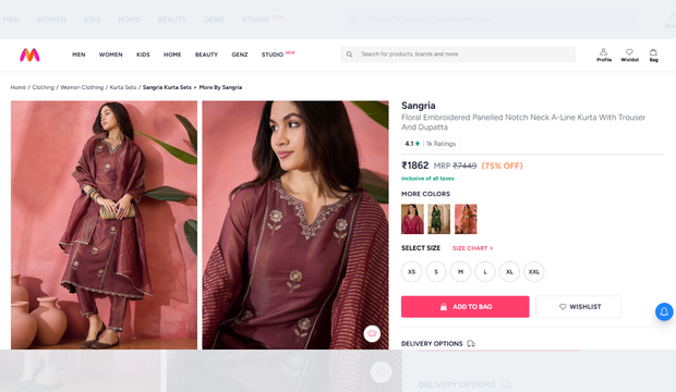
For example, leading e-commerce sites surface price, delivery promise, and “Add to Cart” first, while detailed specifications and policies sit behind tabs or accordions. This approach reduces cognitive load, speeds up decision-making, and keeps users focused on moving forward instead of processing everything at once.
Website that dumps information:
 Website that presents information neatly and clearly:
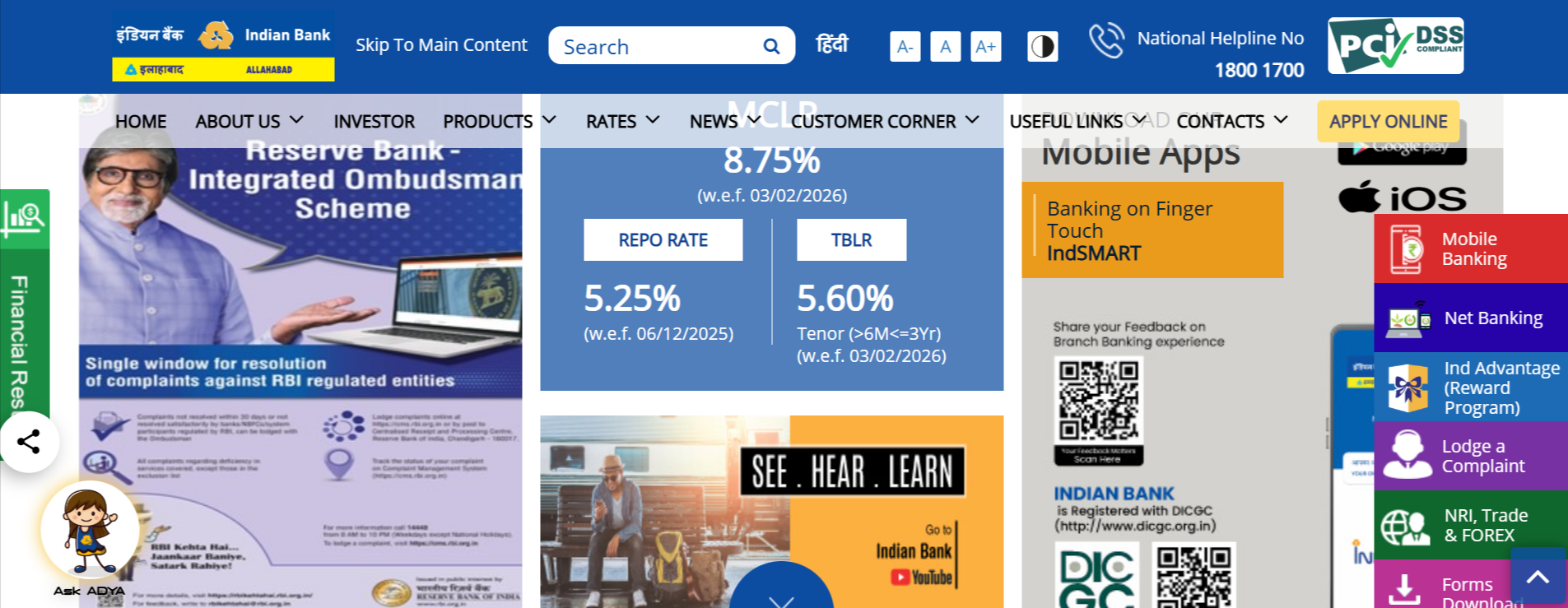
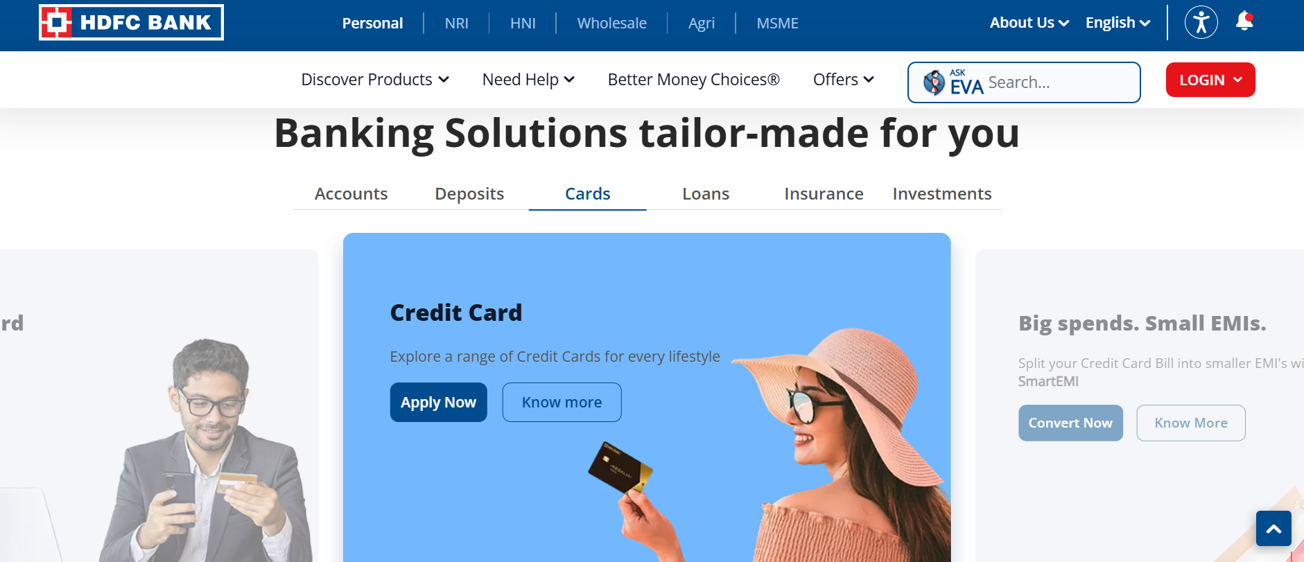 Typography That Undermines Readability and Trust
Typography mistakes often occur when visual identity is prioritised over usability.
Fonts that misalign with the brand’s industry
- Inconsistent sizing
- Tight line spacing
… are often flagged as reasons users disengage before fully reading the content.
Customers/ potential clients don’t come to your website to read content; they want to scan through the layout in search of important information. If the text is difficult to scan or visually fatiguing, users subconsciously associate that discomfort with the brand itself.
What works instead:
Conversion-focused typography is designed for how people read, not just how pages look.
Effective interfaces use typography systems that support scanning, with:
- Clear heading hierarchies
- Sufficient line spacing
- Consistent font sizing
Adequate contrast between text and background is critical, especially on mobile devices where readability drops quickly.
For example, high-performing content and SaaS platforms typically use larger body text, clear section breaks, and restrained font styles to make value propositions easy to grasp at a glance. When users can quickly scan, understand, and trust what they are reading, they are far more likely to continue down the conversion path.
Typography based on your industry:
|
Industry Type |
Font Type Required | Recommended Font Category |
Why This Font Works |
| Enterprise B2B SaaS | Neutral, confident, scalable | Humanist Sans / Neo-Grotesk Sans | High readability across dashboards, enterprise-grade trust |
| B2B Developer Tools & APIs | Systematic, structured | Geometric Sans / Monospace Support | Aligns with logic, code-centric environments |
| Fintech & Banking | Calm, authoritative | Humanist Sans + Subtle Serif | Signals security, clarity, and reliability |
| Healthcare, HealthTech, Clinical Platforms | Reassuring, neutral | Humanist Sans | Reduces anxiety and improves comprehension |
| Professional Services (Legal, Consulting, Accounting) | Mature, composed | Modern Serif + Clean Sans | Authority combined with digital clarity |
| B2B Manufacturing, Logistics, Industrial | Solid, no-nonsense | Grotesk Sans | Functional clarity over emotion |
| D2C Lifestyle & Fashion | Expressive, modern | Contemporary Sans / Display Serif | Brand personality and differentiation |
| Luxury & Premium Consumer Brands | Elegant, restrained | High-Contrast Serif | Signals craftsmanship and exclusivity |
Website with unclear typography:

Website that nails typography:
PRO TIP: Using Google Fonts can improve page load speed because they are served through a global CDN and are often already cached in users’ browsers.
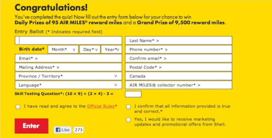
Forms That Ask for Too Much, Too Soon
Filling forms should not look like ones used in government entrance exams. Designers and CRO professionals alike point to forms with excessive required fields, unclear field labels, or intrusive data requests as a primary source of friction.
The underlying issue is misalignment between user intent and data collection. Many forms are designed based on internal sales or marketing needs rather than the user’s readiness to commit.
This is especially relevant in lead-generation flows, demo requests, and checkout processes. Even high-intent users will disengage if the form feels unnecessarily demanding.
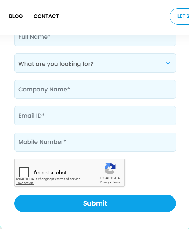
What works instead:
We design our forms based on user intent, not internal data requirements.
Effective experiences limit required fields to only what is necessary at that stage, while clearly explaining why certain information is being requested.
For example, a good demo form will have only the basic requirements like brand name work email, service requirements and sometimes phone number.
This approach helps you get initial data without overwhelming the users. It helps reduces friction, builds trust, and keeps momentum intact, resulting in higher completion rates.
Examples of bad form:
Example of a simple yet effective form:
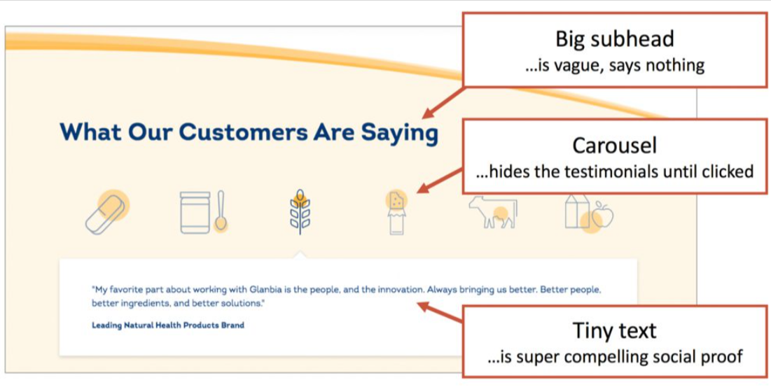
 Missing or Weak Social Proof Signals
This is a silent killer. In many cases, the product or service itself is solid, but the interface fails to communicate trust.
Statements like “trusted by teams worldwide” or “industry-leading solution” are frequently called out when unsupported by evidence.
For decision-makers evaluating risk, especially in B2B or high-value purchases, the absence of credible proof introduces doubt. Brands will hesitate if they don’t find:
- Testimonials case references
- Recognisable client logos
- Transparent indicators of adoption
What works instead:
Effective social proof is specific and credible.
Rather than generic claims, we use authentic signals such as:
- Short testimonials
- Recognisable client logos
- Companies KPIs numbers
- Quantified outcomes placed near pricing sections, CTAs, or forms.
For example, B2B service and SaaS websites often reinforce trust by showing customer logos or a relevant testimonial directly beside a “Request a Demo” button.
Websites with poor social proof:
 Websites that showcase social proof clearly:
 Slowness Across Key Interactions, Not Just Page Load
If your website is slow, it’s going to get ignored by both humans and AI. For brands investing heavily in performance marketing, slow load times quietly drain ad budgets and inflate customer acquisition costs.
Performance issues are a recurring topic but not limited to initial load times. The definition of “slowness” here also includes delayed interactions, unresponsive buttons, slow add-to-cart actions, and unclear loading states.
From a UX perspective, these moments break flow. Even when actual delays are minimal, poor feedback creates the perception of slowness, which erodes confidence.
Users interpret laggy interactions as signals of poor quality or unreliable infrastructure. This is especially damaging in checkout flows or onboarding sequences where trust is critical.
What works instead:
We treat performance as a core part of user experience, not just a technical metric.
Optimised interaction performance ensures that key actions such as adding to cart, submitting a form, or moving between steps respond immediately.
For example, many e-commerce and booking platforms use instant visual feedback when an item is added to the cart, even if processing continues in the background.
Close collaboration between design and engineering teams helps prioritise perceived speed, which directly impacts user confidence and conversion rates.
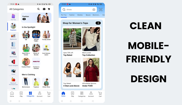
Poor Mobile Experience Treated as an Afterthought
According to a data by bankmycell, more than 4.88 million individuals use smartphones; therefore, if your website is not mobile optimised, you are atleast 10 years in the past.
Common observations include cramped layouts, tap targets that are difficult to interact with, intrusive pop-ups, and content that feels clearly designed for desktop and merely adapted for smaller screens.
Mobile users behave differently; therefore, same layout might not be your ideal option. They scan more, tolerate less friction, and abandon faster. When mobile UX fails to accommodate this behaviour, conversions suffer disproportionately. Traffic driven through social media services is overwhelmingly mobile-first, making responsive, frictionless UX critical to protect engagement and conversion rates.
What works instead:
We design mobile experiences that are designed that caters to mobile behaviour.
Mobile-first design thinking prioritises essential content and actions, ensuring key interactions are easy to reach and use with one hand.
Real-device testing helps uncover issues that simulations often miss, such as awkward tap targets or hidden CTAs.
For example, well-optimised e-commerce apps place primary actions like “Add to Cart” within the natural thumb zone and avoid intrusive overlays. By reducing friction and making actions effortless, mobile-first design directly supports higher engagement and conversion rates.
Websites that don’t pay for attention to user experience:
Websites that pay for attention to user experience:

What These Patterns Reveal About Conversion-Focused UX
When viewed collectively, these mistakes share a common thread. They are not caused by lack of design effort or technical capability. They stem from misaligned priorities.
From our decade worth of experience, we observed that high-converting experiences are built around reducing effort, increasing clarity, and reinforcing trust at every step. Each of the issues outlined above introduces friction in one of those areas.
Importantly, these mistakes rarely exist in isolation. Information overload often pairs with poor typography. Complex forms compound trust issues. Slowness amplifies frustration on mobile.
Sustainable growth happens when UX optimisation works alongside strong SEO services, strategic performance marketing, and structured content marketing services.
For decision-makers, the takeaway is clear: conversion optimisation is not about incremental tweaks alone. It requires a holistic view of how design decisions influence user confidence and momentum.
Closing Thoughts
These are the top mistakes brands make, usually unknowingly, when designing their website. We noticed that the value lies not in copying opinions, but in recognising signals. When the same design issues surface repeatedly across different products, industries, and contexts, they warrant serious attention.
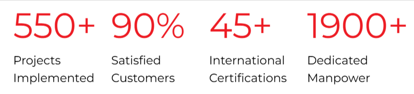
Is your brand struggling with one of these challenges? You can contact us at Sudha Solutions. Our client list includes brands like Manyavar, LEGO, Colorbar, Khetika, Signet, Anarock, MyGromor, and more. Our design team brings together strategic thinking, UX expertise, and real-world conversion insight to build experiences that perform, not just look good. Visit Sudha Solutions to learn more about our methodologies and work.
Frequently Asked Questions
1. How do I know if my website’s UI/UX is hurting conversions?
If users visit but don’t take action, common signals include high bounce rates, low scroll depth, abandoned forms, and repeated visits without conversion. Heatmaps, session recordings, and funnel analysis often reveal friction points users don’t explicitly report.
2. What is the biggest UI/UX factor that impacts conversions the most?
Clarity. Users convert when they immediately understand what you offer, why it matters to them, and what to do next. Even visually impressive websites fail when messaging, hierarchy, or CTAs are unclear.
3. Can good UI/UX really improve trust for new or unknown brands?
Yes. For unfamiliar brands, design is the first credibility signal. Clean layouts, readable typography, fast interactions, and visible social proof subconsciously reassure users that the brand is legitimate and reliable.